Chevez Design System
A bilingual design system for a law firm in Mexico, the US and Spain: from an audit of the old site to a Figma system and a live Webflow site with 8 CMS collections that the client's team now runs on its own.
A bilingual design system for a law firm in Mexico, the US and Spain: from an audit of the old site to a Figma system and a live Webflow site with 8 CMS collections that the client's team now runs on its own.


2026
PRODUCT DESIGNER
DESIGN SYSTEM
PRODUCT DESIGN
WEBFLOW BUILD
Client: Chevez, law firm with offices in Mexico, the United States and Spain
Via: Redbox (digital agency), freelance
Team: Grecia and Majo led visual design and branding and produced a first visual pass of the UI.
I turned that direction into a functional, componentized system for the web, then built it in Webflow.
Tools: Figma (variables, components, Auto Layout) · Webflow · Claude + MCP
As part of a brand refresh led by the Redbox team, the firm moved from "Chevez, Ruiz, Zamarripa" to simply "Chevez". The new site had to carry that identity in Spanish and English, with years of publications, a team directory of 200+ people, 18 practice areas, and different levels of access for clients and partners.
Before designing anything, I audited the previous site page by page: about 40 pages across seven sections.
One template for everything. Practices, people and eight types of publications all used the same banner + content layout, so readers couldn't tell them apart.
Four menus, four behaviors. Each dropdown worked differently, so there was no pattern to learn.
Labels that didn't match. Practice names changed between the menu and the page.
Content search engines couldn't read. Many publications lived only as PDFs.
A directory with no way in. No search, no filters, and no explanation of what a partner, director or associate is.

The old site had pages, not a content model. The goal: define each content type by its format, structure and metadata, then build a system a small team could design once and the client's team could keep publishing in without breaking it.
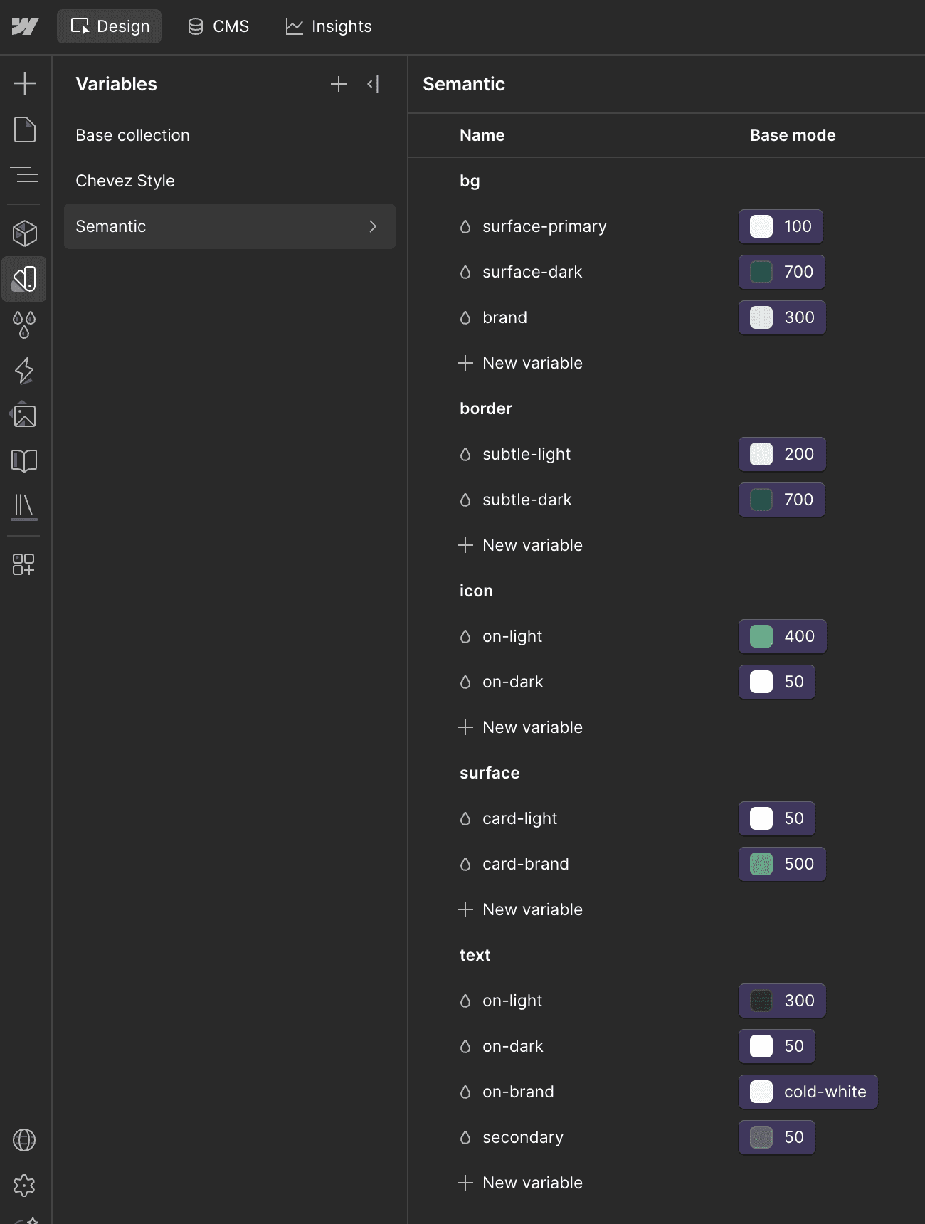
Three layers of color. Primitives hold the values. A brand palette keeps the client's own names (Chevez Green, Deep Teal). Semantic tokens (bg, text, border, action) are the only layer components use, so a brand change touches one variable, not fifty layers.

One typeface, named by role. Public Sans only, with styles named by breakpoint and role. Two roles that look the same today, Label and Nav Lateral, stay separate so one can change without breaking the other.
Components that mirror real states. The navigation is one component with 24 variants: breakpoint × session × language. Those are the states the site actually has.

One pattern per job. Each content type gets its own template and CMS collection. Publications filter by type; the team directory has search and filters by practice, role and city.


I designed the system and built it in Webflow myself, so the handoff was a translation, not a throw over the wall.
Tokens moved one-to-one. The same 27 primitives and 13 semantic tokens, with the same names, values and aliases. Text styles became classes named by role.
8 CMS collections, ~680 entries. Publications, team, practices, offices and recognitions, each with its own template. Publications became full-text pages that search engines can read.
AI in the build. I used Claude connected through MCP to the Webflow API and to Figma to build sections, load content in bulk, run QA and publish.
Two-tier access. Client registration with approval (Outseta) and Microsoft 365 sign-in for partners (Descope + Azure AD).
I didn't have the full picture until I started building. As the client's feedback clarified who their clients, users and partners were, we shaped the architecture around those needs instead of bending the client to fit the tool.
Spain got its own publications, written for its region, with its own page.
English is curated, not mirrored. It carries content relevant to that audience, not a translated copy of everything.

A live bilingual site for three countries, built on one system.
A reversible public mode. When the stakeholders decided to keep all content public for now, the access system didn't have to be taken apart: because session states were part of the system from the start, opening the site was a switch, not a rebuild.
The client's team runs the site on its own: publishing, adding partners, managing roles and editing pages without help.
After launch, I audited the system and formalized it:
Before | After | |
|---|---|---|
Typefaces | 2 | 1 |
Component text using a text style | 5% | 100% |
Semantic color tokens | 13 | 32 |
Component colors on semantic tokens | ~3% | 100% |
Navigation variants | 14, with gaps | 24, complete |
I'd set up the semantic layer and component properties from day one, and publish the system as a Figma library so new pages start from it. In Webflow, I'd rely more on global classes than page-specific ones. Next: bring the new tokens and the single typeface into Webflow, and move type sizes to variables with breakpoint modes.


A bilingual design system for a law firm in Mexico, the US and Spain: from an audit of the old site to a Figma system and a live Webflow site with 8 CMS collections that the client's team now runs on its own.
2026
PRODUCT DESIGNER
DESIGN SYSTEM
PRODUCT DESIGN
WEBFLOW BUILD
Client: Chevez, law firm with offices in Mexico, the United States and Spain
Via: Redbox (digital agency), freelance
Team: Grecia and Majo led visual design and branding and produced a first visual pass of the UI.
I turned that direction into a functional, componentized system for the web, then built it in Webflow.
Tools: Figma (variables, components, Auto Layout) · Webflow · Claude + MCP
As part of a brand refresh led by the Redbox team, the firm moved from "Chevez, Ruiz, Zamarripa" to simply "Chevez". The new site had to carry that identity in Spanish and English, with years of publications, a team directory of 200+ people, 18 practice areas, and different levels of access for clients and partners.
Before designing anything, I audited the previous site page by page: about 40 pages across seven sections.
One template for everything. Practices, people and eight types of publications all used the same banner + content layout, so readers couldn't tell them apart.
Four menus, four behaviors. Each dropdown worked differently, so there was no pattern to learn.
Labels that didn't match. Practice names changed between the menu and the page.
Content search engines couldn't read. Many publications lived only as PDFs.
A directory with no way in. No search, no filters, and no explanation of what a partner, director or associate is.
The old site had pages, not a content model. The goal: define each content type by its format, structure and metadata, then build a system a small team could design once and the client's team could keep publishing in without breaking it.
Three layers of color. Primitives hold the values. A brand palette keeps the client's own names (Chevez Green, Deep Teal). Semantic tokens (bg, text, border, action) are the only layer components use, so a brand change touches one variable, not fifty layers.
One typeface, named by role. Public Sans only, with styles named by breakpoint and role. Two roles that look the same today, Label and Nav Lateral, stay separate so one can change without breaking the other.
Components that mirror real states. The navigation is one component with 24 variants: breakpoint × session × language. Those are the states the site actually has.
One pattern per job. Each content type gets its own template and CMS collection. Publications filter by type; the team directory has search and filters by practice, role and city.
I designed the system and built it in Webflow myself, so the handoff was a translation, not a throw over the wall.
Tokens moved one-to-one. The same 27 primitives and 13 semantic tokens, with the same names, values and aliases. Text styles became classes named by role.
8 CMS collections, ~680 entries. Publications, team, practices, offices and recognitions, each with its own template. Publications became full-text pages that search engines can read.
AI in the build. I used Claude connected through MCP to the Webflow API and to Figma to build sections, load content in bulk, run QA and publish.
Two-tier access. Client registration with approval (Outseta) and Microsoft 365 sign-in for partners (Descope + Azure AD).
I didn't have the full picture until I started building. As the client's feedback clarified who their clients, users and partners were, we shaped the architecture around those needs instead of bending the client to fit the tool.
Spain got its own publications, written for its region, with its own page.
English is curated, not mirrored. It carries content relevant to that audience, not a translated copy of everything.
A live bilingual site for three countries, built on one system.
A reversible public mode. When the stakeholders decided to keep all content public for now, the access system didn't have to be taken apart: because session states were part of the system from the start, opening the site was a switch, not a rebuild.
The client's team runs the site on its own: publishing, adding partners, managing roles and editing pages without help.
After launch, I audited the system and formalized it:
Before | After | |
|---|---|---|
Typefaces | 2 | 1 |
Component text using a text style | 5% | 100% |
Semantic color tokens | 13 | 32 |
Component colors on semantic tokens | ~3% | 100% |
Navigation variants | 14, with gaps | 24, complete |
I'd set up the semantic layer and component properties from day one, and publish the system as a Figma library so new pages start from it. In Webflow, I'd rely more on global classes than page-specific ones. Next: bring the new tokens and the single typeface into Webflow, and move type sizes to variables with breakpoint modes.
A bilingual design system for a law firm in Mexico, the US and Spain: from an audit of the old site to a Figma system and a live Webflow site with 8 CMS collections that the client's team now runs on its own.
2026
PRODUCT DESIGNER
DESIGN SYSTEM
PRODUCT DESIGN
WEBFLOW BUILD
Client: Chevez, law firm with offices in Mexico, the United States and Spain
Via: Redbox (digital agency), freelance
Team: Grecia and Majo led visual design and branding and produced a first visual pass of the UI.
I turned that direction into a functional, componentized system for the web, then built it in Webflow.
Tools: Figma (variables, components, Auto Layout) · Webflow · Claude + MCP
As part of a brand refresh led by the Redbox team, the firm moved from "Chevez, Ruiz, Zamarripa" to simply "Chevez". The new site had to carry that identity in Spanish and English, with years of publications, a team directory of 200+ people, 18 practice areas, and different levels of access for clients and partners.
Before designing anything, I audited the previous site page by page: about 40 pages across seven sections.
One template for everything. Practices, people and eight types of publications all used the same banner + content layout, so readers couldn't tell them apart.
Four menus, four behaviors. Each dropdown worked differently, so there was no pattern to learn.
Labels that didn't match. Practice names changed between the menu and the page.
Content search engines couldn't read. Many publications lived only as PDFs.
A directory with no way in. No search, no filters, and no explanation of what a partner, director or associate is.
The old site had pages, not a content model. The goal: define each content type by its format, structure and metadata, then build a system a small team could design once and the client's team could keep publishing in without breaking it.
Three layers of color. Primitives hold the values. A brand palette keeps the client's own names (Chevez Green, Deep Teal). Semantic tokens (bg, text, border, action) are the only layer components use, so a brand change touches one variable, not fifty layers.
One typeface, named by role. Public Sans only, with styles named by breakpoint and role. Two roles that look the same today, Label and Nav Lateral, stay separate so one can change without breaking the other.
Components that mirror real states. The navigation is one component with 24 variants: breakpoint × session × language. Those are the states the site actually has.
One pattern per job. Each content type gets its own template and CMS collection. Publications filter by type; the team directory has search and filters by practice, role and city.
I designed the system and built it in Webflow myself, so the handoff was a translation, not a throw over the wall.
Tokens moved one-to-one. The same 27 primitives and 13 semantic tokens, with the same names, values and aliases. Text styles became classes named by role.
8 CMS collections, ~680 entries. Publications, team, practices, offices and recognitions, each with its own template. Publications became full-text pages that search engines can read.
AI in the build. I used Claude connected through MCP to the Webflow API and to Figma to build sections, load content in bulk, run QA and publish.
Two-tier access. Client registration with approval (Outseta) and Microsoft 365 sign-in for partners (Descope + Azure AD).
I didn't have the full picture until I started building. As the client's feedback clarified who their clients, users and partners were, we shaped the architecture around those needs instead of bending the client to fit the tool.
Spain got its own publications, written for its region, with its own page.
English is curated, not mirrored. It carries content relevant to that audience, not a translated copy of everything.
A live bilingual site for three countries, built on one system.
A reversible public mode. When the stakeholders decided to keep all content public for now, the access system didn't have to be taken apart: because session states were part of the system from the start, opening the site was a switch, not a rebuild.
The client's team runs the site on its own: publishing, adding partners, managing roles and editing pages without help.
After launch, I audited the system and formalized it:
Before | After | |
|---|---|---|
Typefaces | 2 | 1 |
Component text using a text style | 5% | 100% |
Semantic color tokens | 13 | 32 |
Component colors on semantic tokens | ~3% | 100% |
Navigation variants | 14, with gaps | 24, complete |
I'd set up the semantic layer and component properties from day one, and publish the system as a Figma library so new pages start from it. In Webflow, I'd rely more on global classes than page-specific ones. Next: bring the new tokens and the single typeface into Webflow, and move type sizes to variables with breakpoint modes.